Connect2Calm
An application offers immediate access to mental health resources, integrating various tools to enhance overall well-being.
ROLE
• User research
• Usability testing
• Prototyping
• Project Management
TIMELINE
12 weeks
Sept - Dec 2023
TYPE
Student Team Project
Introducing Connect2Calm, a purposeful platform crafted to provide instant access to mental health support via a user-friendly mobile app.
This project, undertaken during my first semester in the Master's program for Human Centered Design and User Experience, is a comprehensive exploration of the design process. From analyzing user needs to iterative design, presenting a compelling solution, and creating detailed prototypes with a keen focus on meeting user needs.
Throughout the project, specific areas of investigation included:
Uncovering the motivations and behaviors that drive users to share their feelings and mental health concerns, seeking and providing advice.
Identifying pain points and challenges users encounter when engaging in discussions about feelings and mental health concerns.
Gaining insights into users' social and cultural contexts, understanding how these factors influence their mental health-related activities.
Examining users' utilization of technology, including apps and websites, for seeking mental health consultations and sharing advice.
Professor: Reynold Benoit, UX Design Manager at Google
With a background in Psychology, my awareness of mental well-being is inherent. In my initial two years of undergraduate study—a period marked by a shift in environment, interactions, and the pursuit of personal growth—I found myself struggling to pinpoint my emotions, lacking sufficient knowledge and resources for external support. This project allowed me to delve into user pain points and needs, inspiring the design of something that can potentially offer assistance.
Proactive Team Lead
I took charge of the roles of project management, progress tracking, problem-solving, effective communication, and formatting to align the project with the course objectives and professor's expectations.
Problem Solving with Time Constraint
Managing this project under time constraints has taught me the art of prioritizing features and cultivating empathy for users. Despite lacking prior experience in UI/UX design, and with weekly progress presentations, the project provided me with an opportunity to hone and showcase my prototyping and UI skills.
What are we trying to solve?
Hesitancy to disclose mental health issues due to social stigma
Limited access to mental health consulting services
Challenges in selecting a compatible counselor or therapist, leading to extra time and cost
Traditional in-person sessions involve filling out forms and introductory sessions to find a good fit
Lack of real-time support for emergent crises
Product Idea
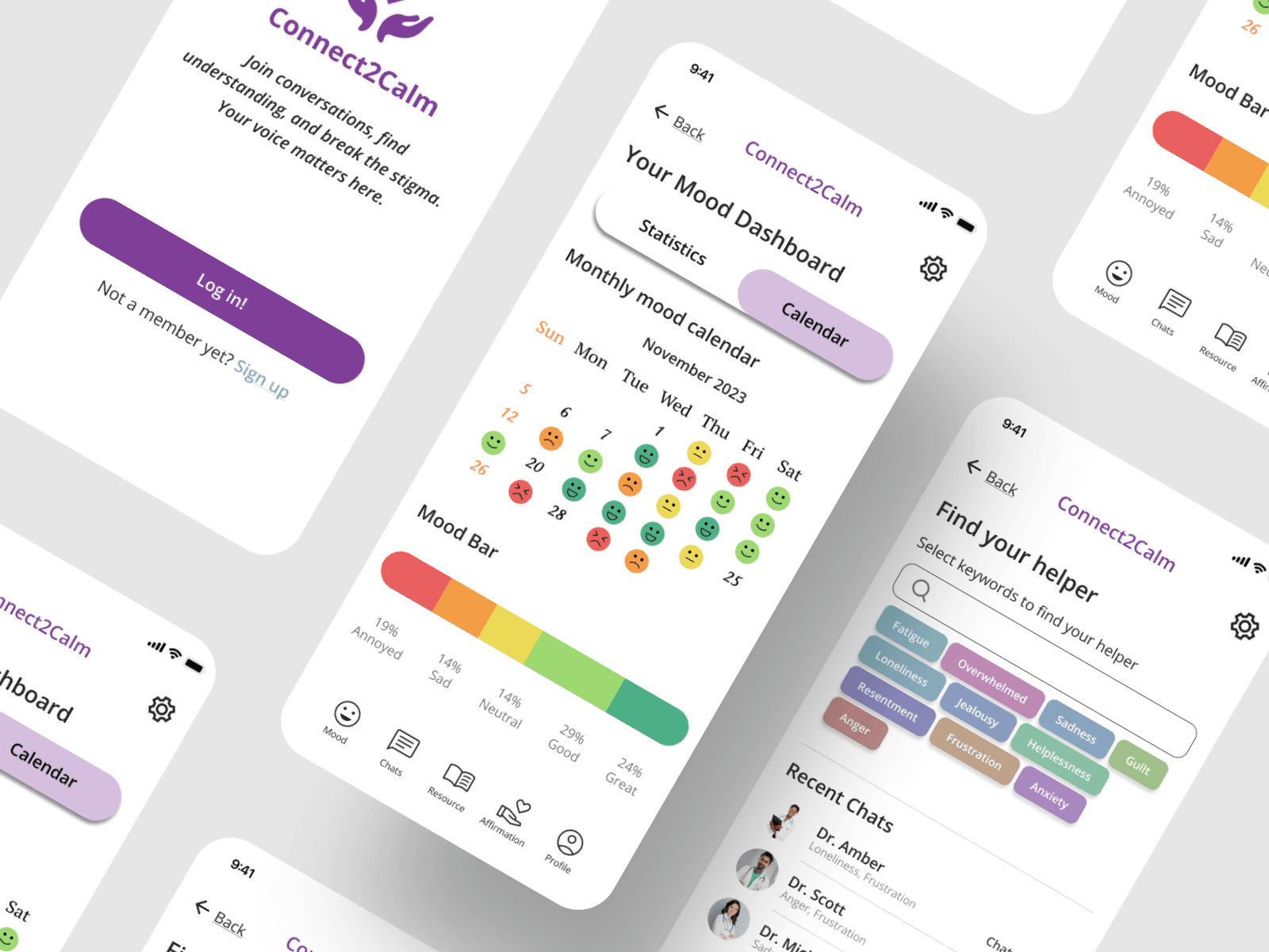
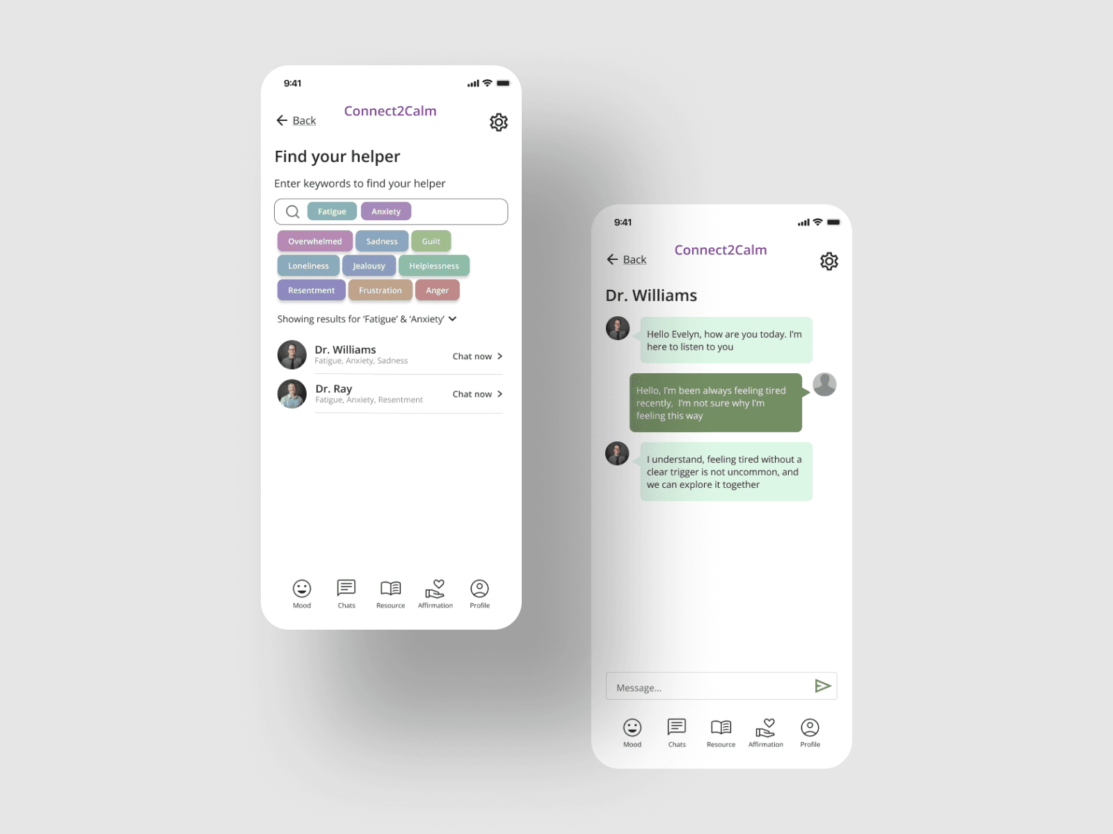
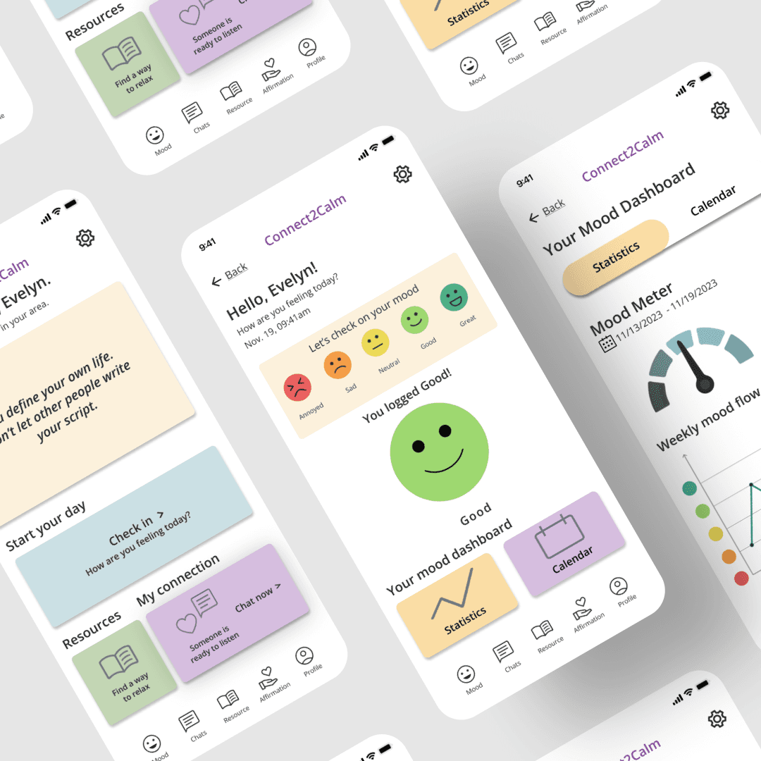
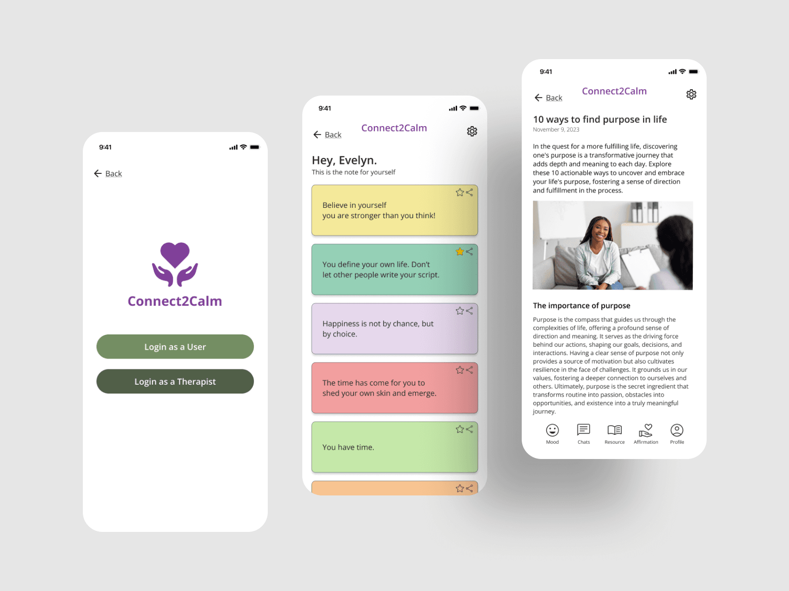
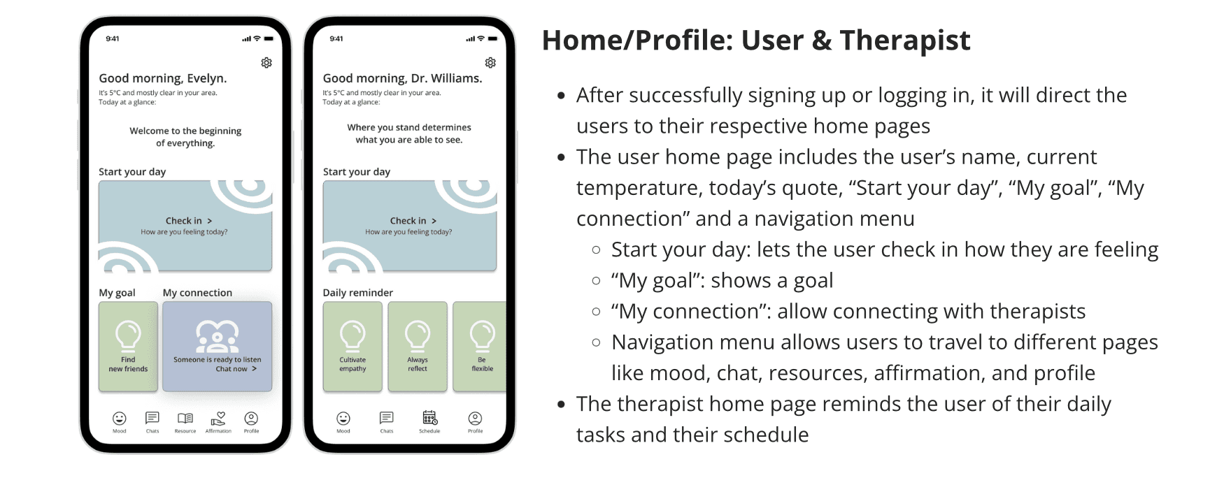
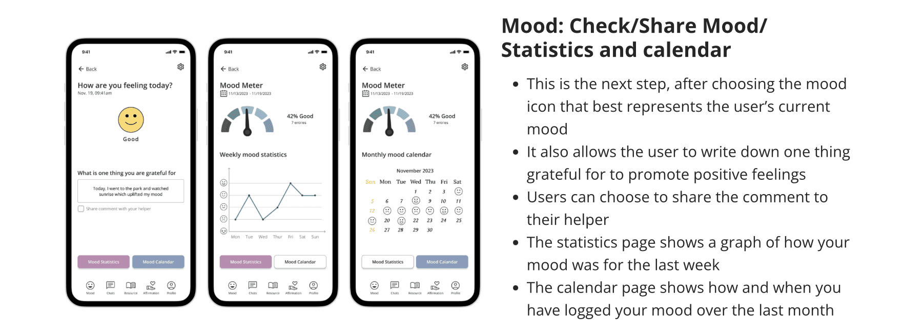
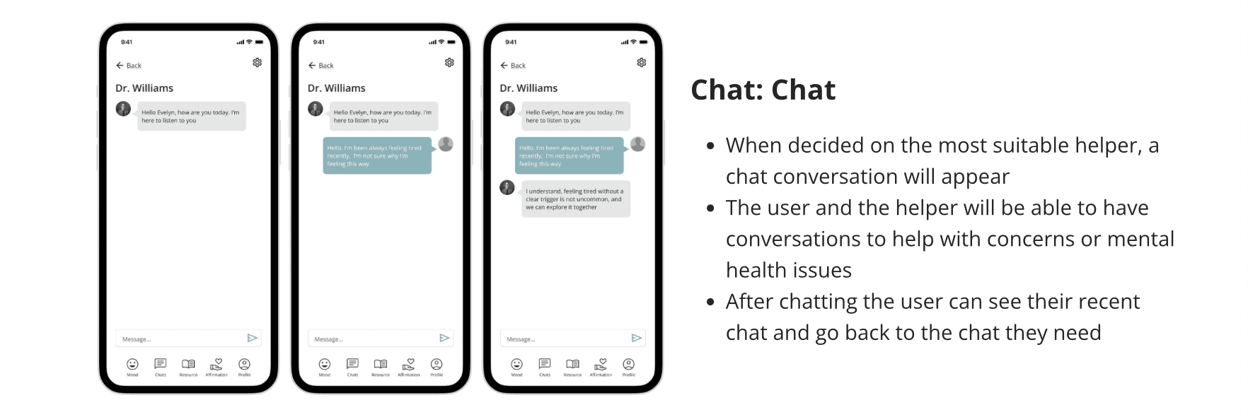
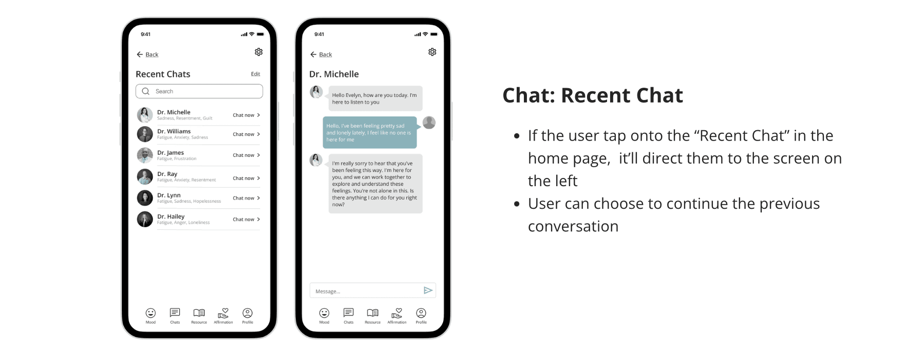
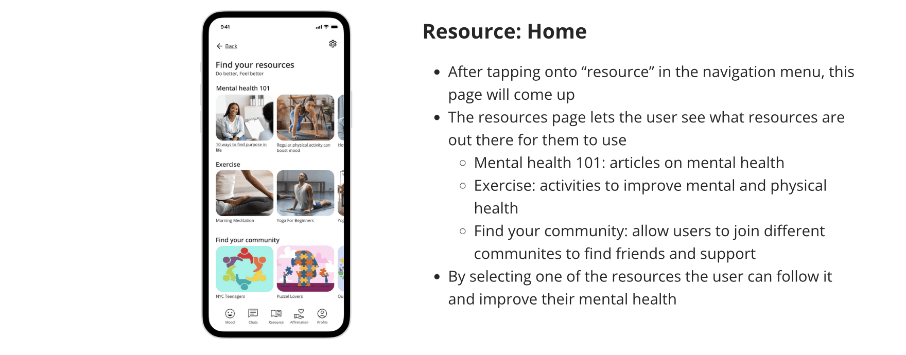
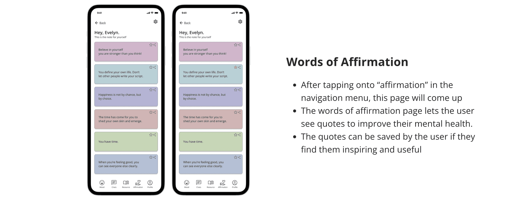
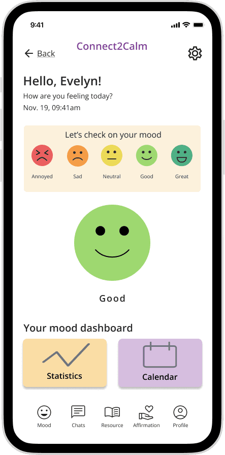
Connect2Calm, a platform crafted to offer instant access to mental health support via a user-friendly mobile app. This platform caters to two main user groups: those in search of mental health assistance and professionals eager to extend their support. Key features include daily mood checks, interactive chats with professional therapists, resources for personal growth, and uplifting words of affirmation.
Connect2Calm is committed to creating an inclusive and empathetic space, empowering individuals to enhance their mental well-being.
Problem Statement
How can we enhance mental health well-being applications to achieve greater success, measured through user satisfaction on the System Usability Scale (SUS) and qualitative feedback?
Uer Research
Objective
Investigate user motivations and behaviors behind sharing feelings and mental health concerns and advice
Identify pain points and challenges users face when sharing feelings and mental health concerns
Understand users’ social and cultural context in their mental health-related activities
Examine users’ utilization of technology, including apps and websites, for mental health consultations and advice-sharing
Provide insights to guide the design team in developing a platform tailored to users’ needs
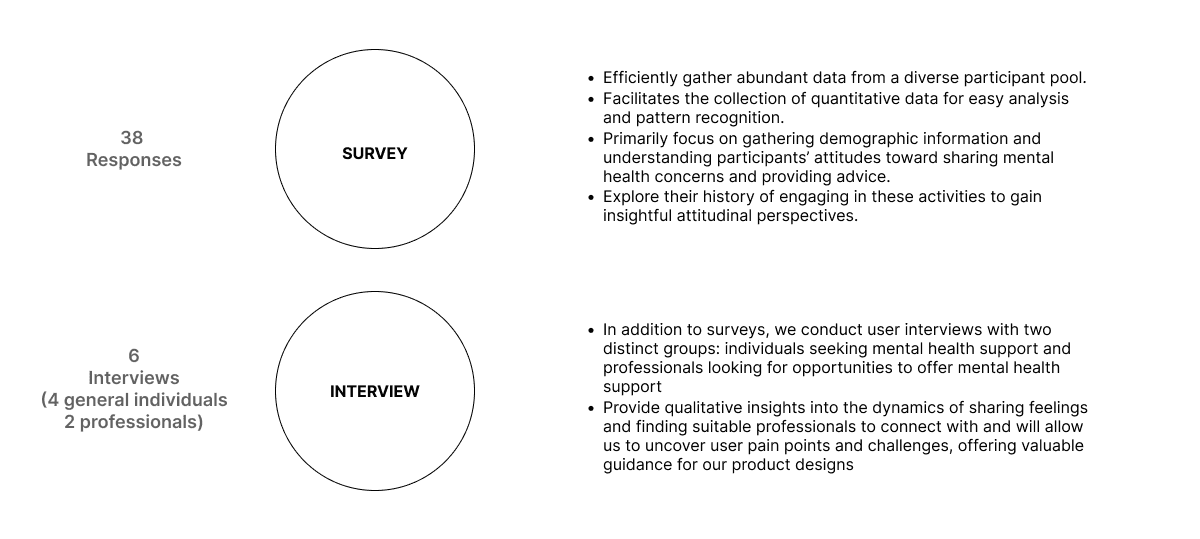
For this project, there are two main user groups we are going to target:
Individuals who might seek for mental health support
This group was chosen to understand what individuals seeking mental health support want to achieve with a mental health application or website. We searched for users who suffer from these mental issues to get a better understanding of their problems and concerns.
Professionals who might seek for opportunities to provide mental health support
This group was chosen to understand what individuals who provide mental health support want to achieve with a mental health application or website. We searched for users who deal with these mental issues to get a better understanding of problems that need to be solved and concerns they have about an application or website.
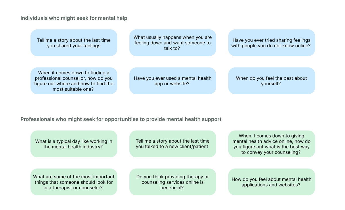
The questions below served as a structure for our research and user testing. We inquired with participants about aspects such as:
User Insights
Survey Qualitative Feedback
There is a huge demand for mental health care, with a significant population being students aged 18 to 24, mainly in the New York City region.
Stress and mental health difficulties impact 81.5% of respondents, with a sizable proportion coping with them every day (26%) or at least once a week (37%).
Notably, talking to close friends and family is the top coping method for 51% of respondents.
Despite the need, a startling 90% of respondents had never utilized a mental health app or online treatment. The key causes of such a low adoption rate include a lack of understanding (36%), as well as privacy and data protection concerns (32%).
Those who have utilized such services reported using a variety of applications for varied mental health issues such as Better Help, Mental wyse, MoodTools, PTSD Coach, daily bean, Days Since.
Surprisingly, even those who are not actively struggling with mental health concerns exhibit a readiness to seek professional treatment (57%).
Interview Direct Quotes
General User 2:
“...its hard to find the one. i go to reviews to see who's good and the list of what they are specialized in and to see if it aligns the thing I'm looking for, like my need...”
General User 3:
“The color the websites, hope its very enjoyable to read and made me feel like depression wasn’t such a bad thing or something medical but more a part of life we need to get over..”
Professional 1:
“...its beneficial because you can have a patient when they need to be away, provide service to people in distant, building up therapeutic relation, stay connected with your client, can still achieve online, connectedness, basic rule is the same...”
Professional 2:
“...so online sessions can be available at any time. It provides accessibility, convenience, and may be more affordable. Also, consultation to people from any part of the world is possible”
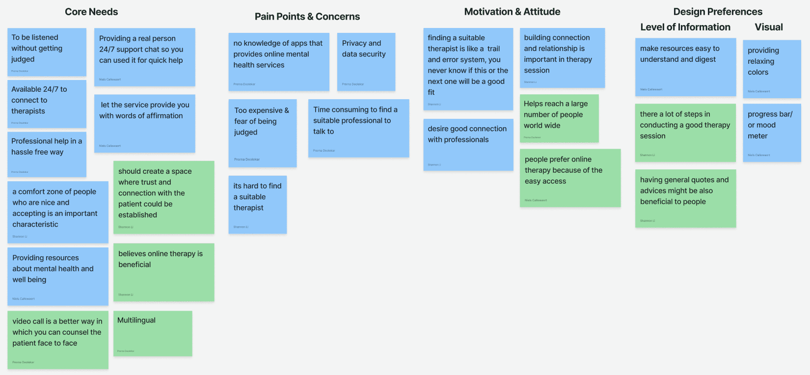
Themes
Interview Insights
When seeking treatment, the expense of therapy surfaced as a key concern. Many others underlined the significance of making mental health treatments free and freely available to everyone.
Hoped for a service offering them words of affirmation and emotional support.
Reported a high need for easily available mental health and well-being materials.
The difficulty in finding an appropriate therapist was a prevalent complaint, with users comparing the process to trial and error, emphasizing the unpredictability of a good fit. It was determined that developing a connection and relationship with their therapist was critical for productive therapy sessions.
Emphasized the necessity of having an actual person handling the 24/7 support chat for immediate assistance.
They particularly valued nonjudgmental listening as a technique of encouraging transparency and self-expression in therapy sessions.
Emphasized the importance of a progress bar/mood meter in tracking their emotional improvement and maintaining self-awareness.
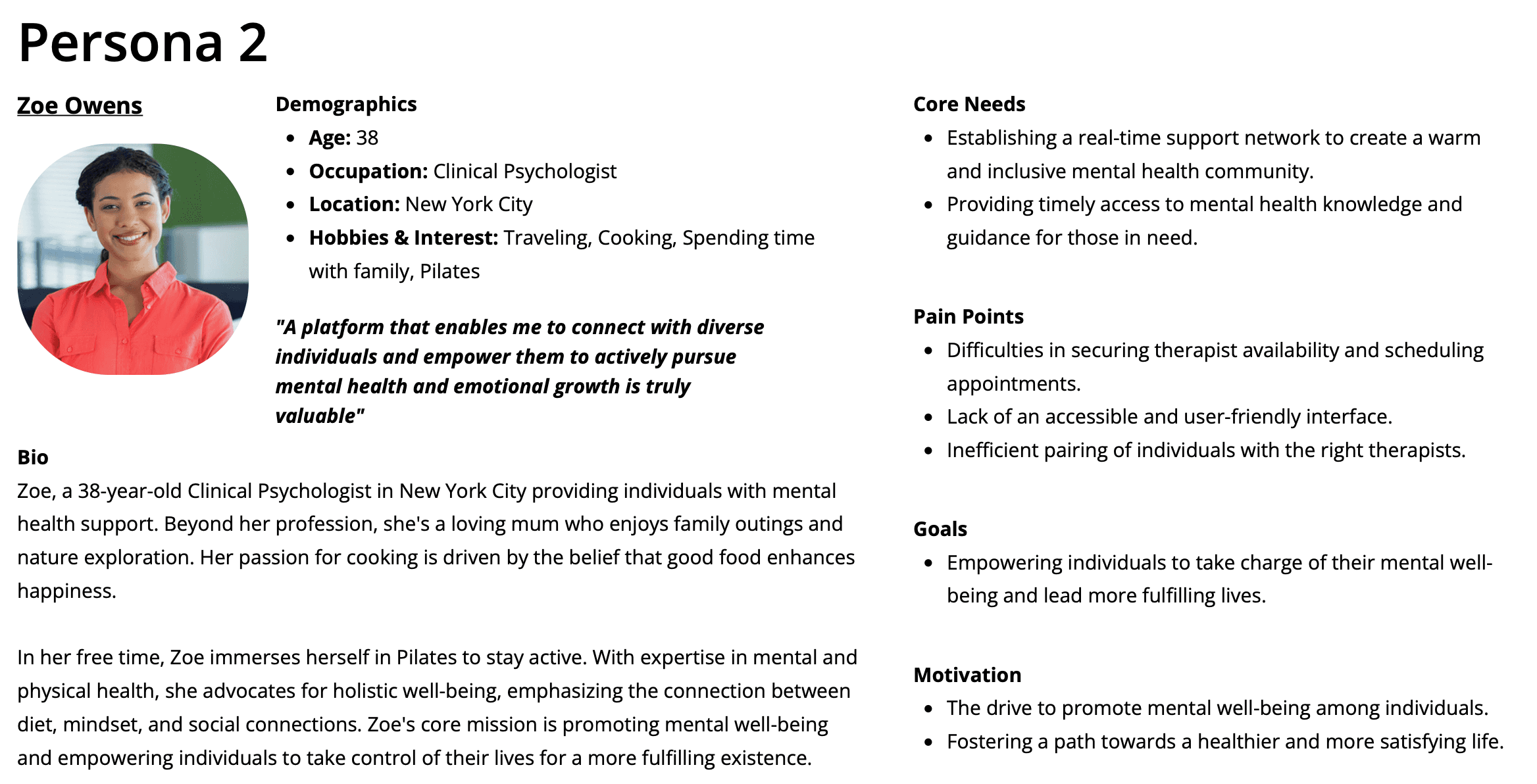
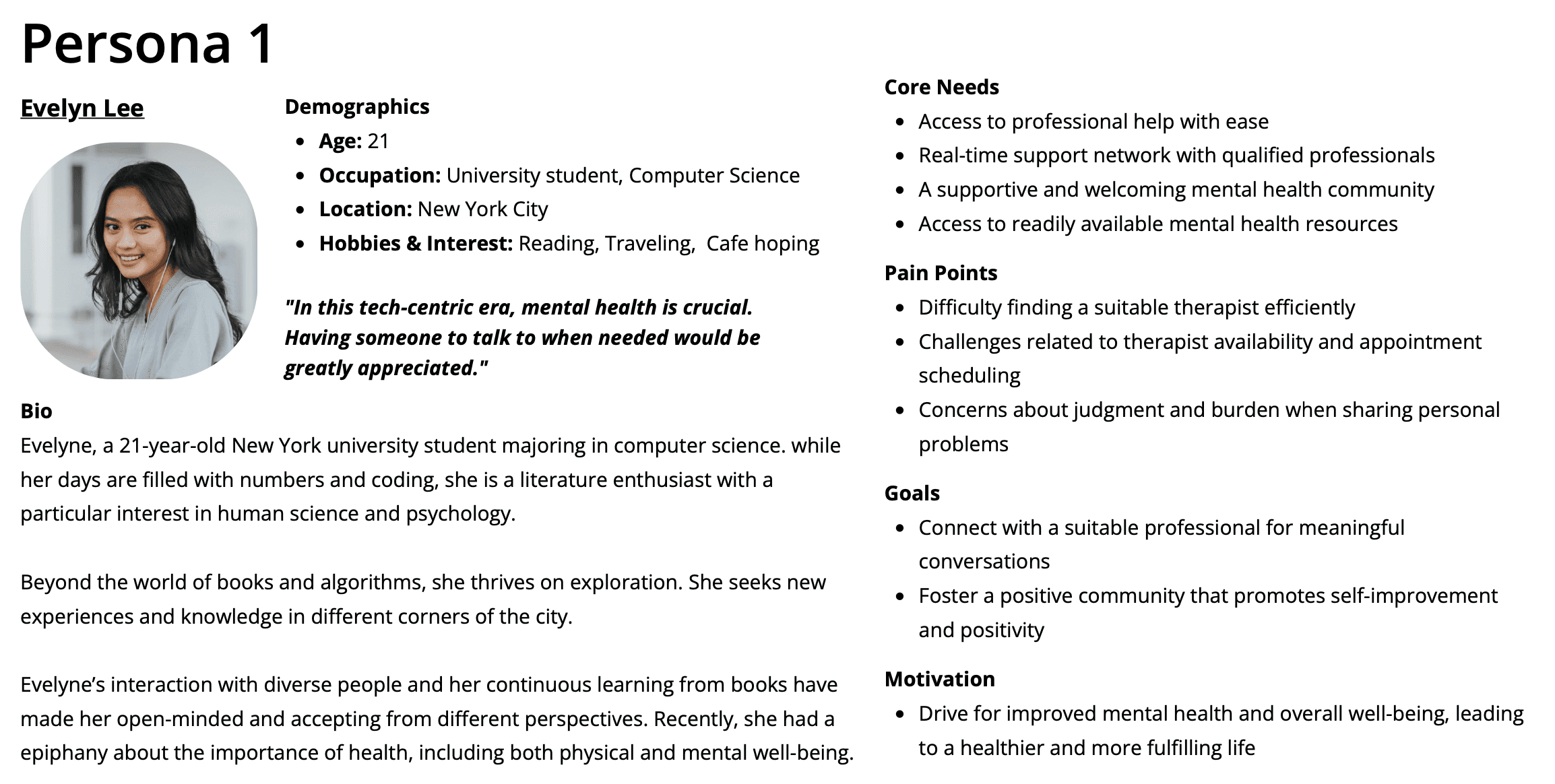
Personas
User Stories

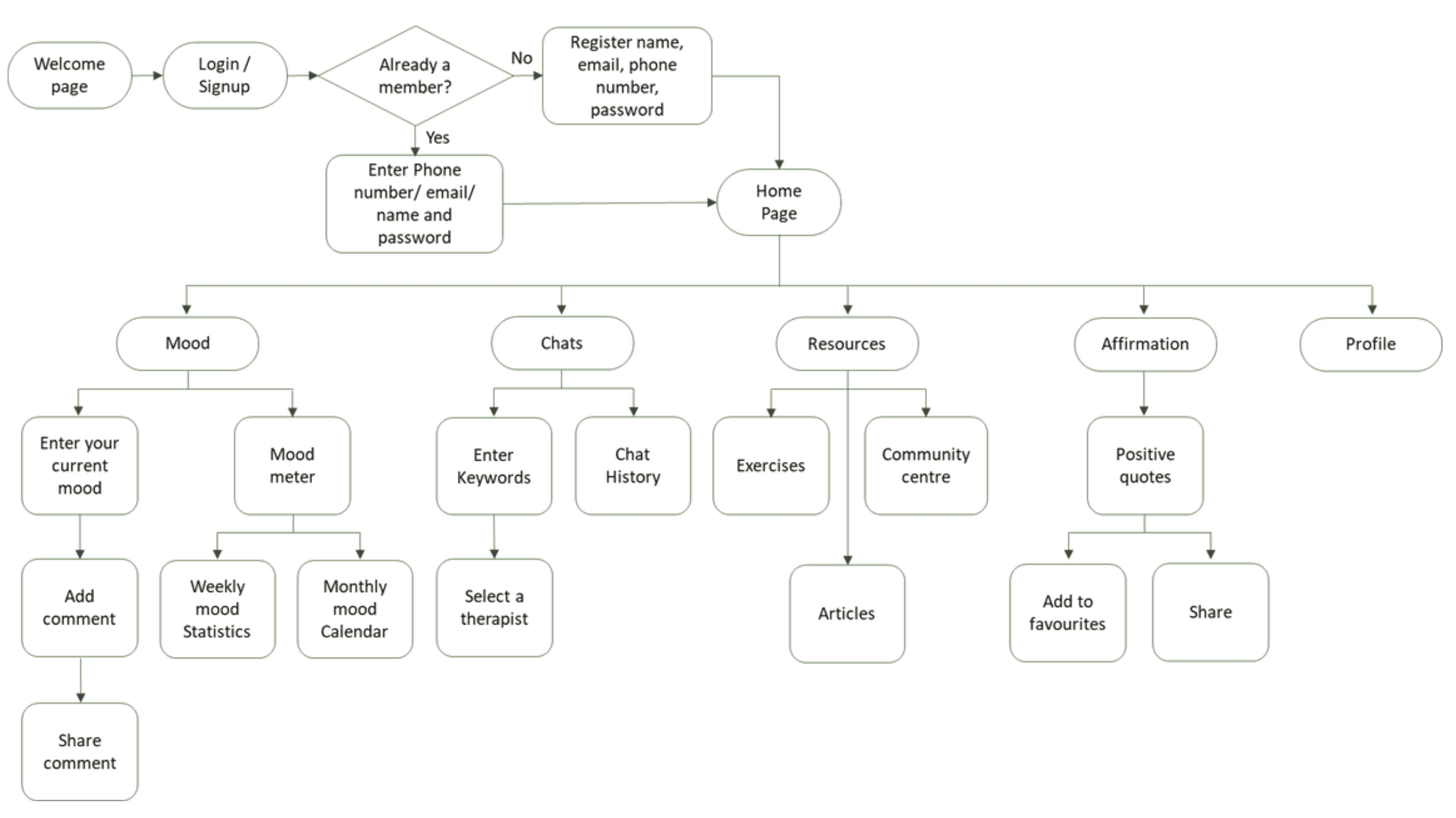
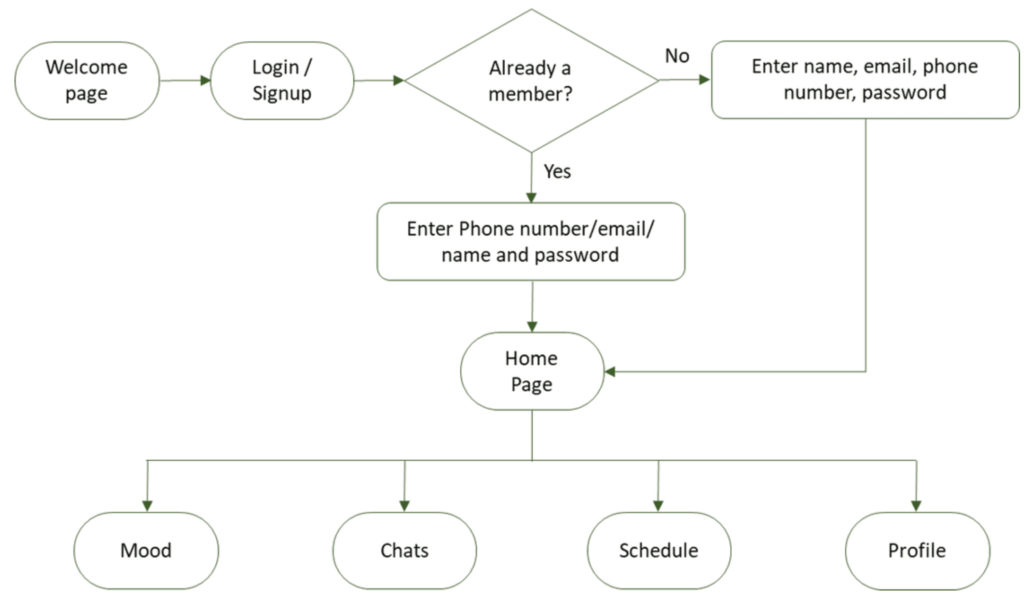
User Flow
General User Diagram
Professional Diagram
Ideation & Brainstorming
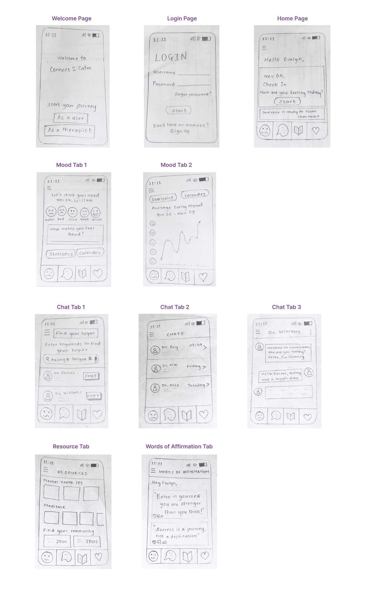
Paper Prototypes
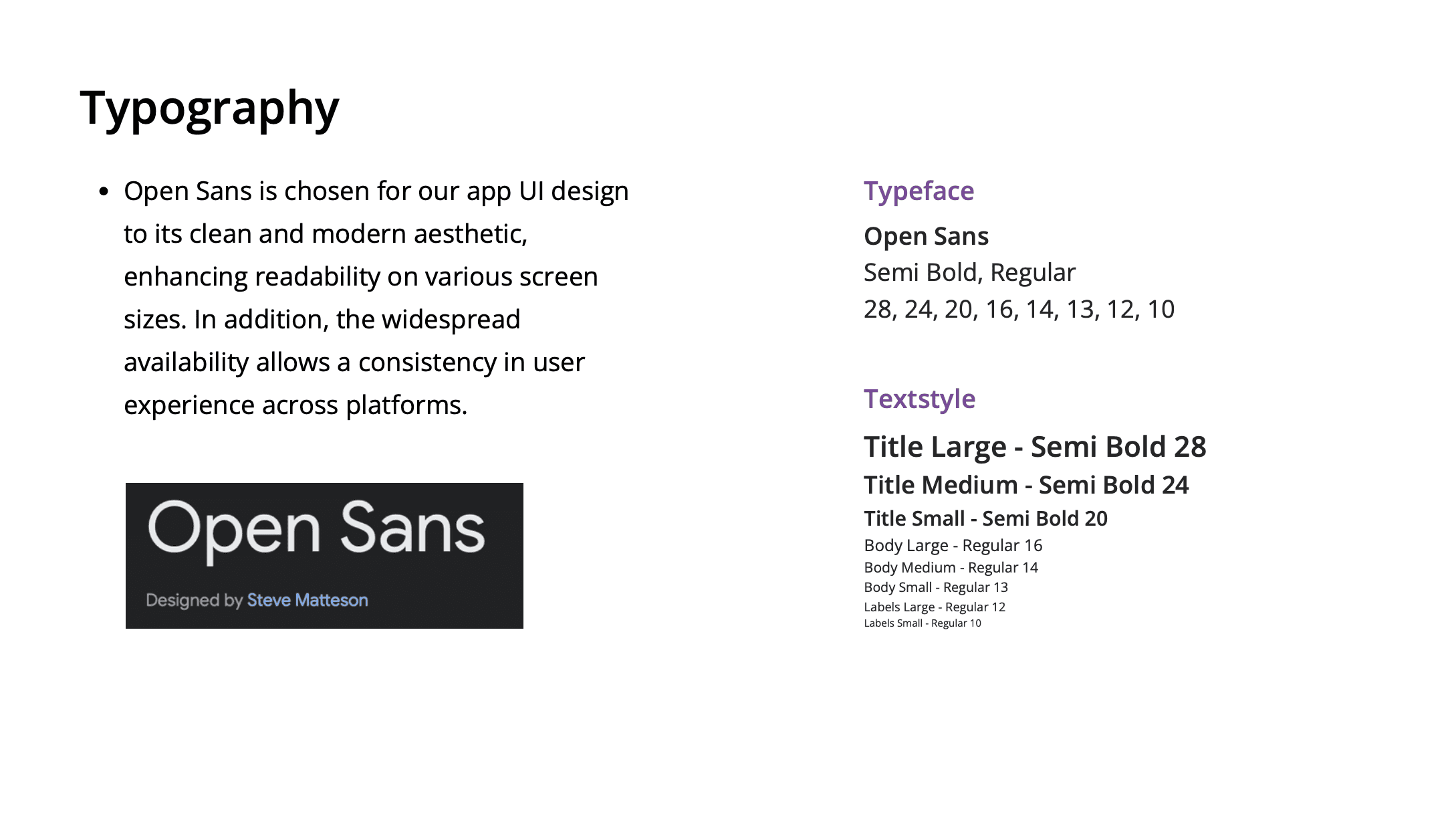
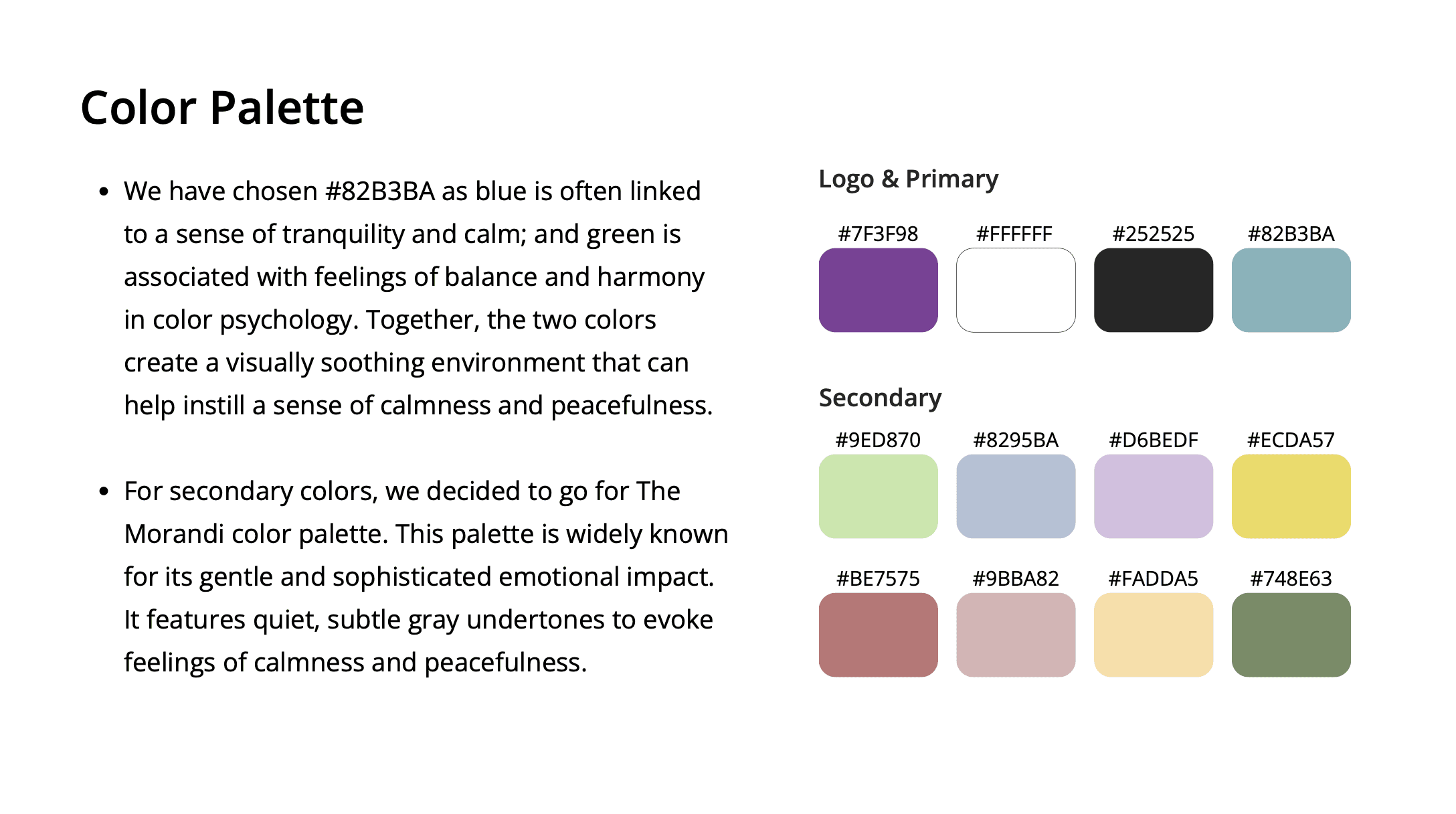
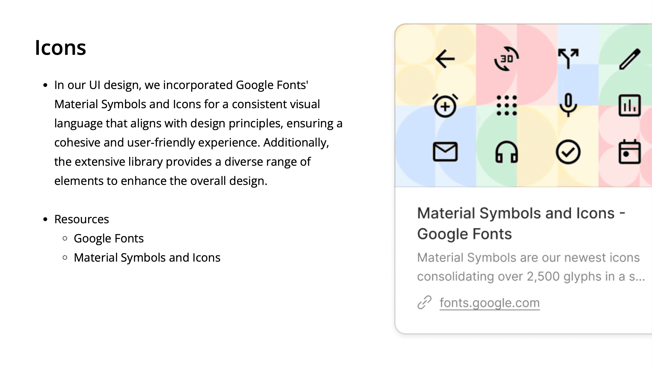
Design Style Guide
For our usability test, we invited the 5 individuals from our earlier user research interviews & participatory design sessions. Their familiarity with the project ensured valuable insights and nuanced feedback, offering a more informed evaluation of our interactive water refill station.
Usability Testing
We reached out to past interviewees to gauge their interest in participating in our app's usability testing.
For data gathering, we used a combination of qualitative and quantitative methods, including contextual inquiry to gain valuable insights about their overall experience, and conductive System Usability Scale (SUS) survey to enable us to quantify our findings from participant's overall user satisfaction and analysis of usability metrics.
For data analysis, we analyzed and synthesized our findings through thematic analysis, this will allow us to identify patterns and explore the physical interactions of our participants systematically.
Our aim is to employ a comprehensive research approach to utterly understand the effectiveness of our product design.
Qualitative Analysis
Scenario & Tasks
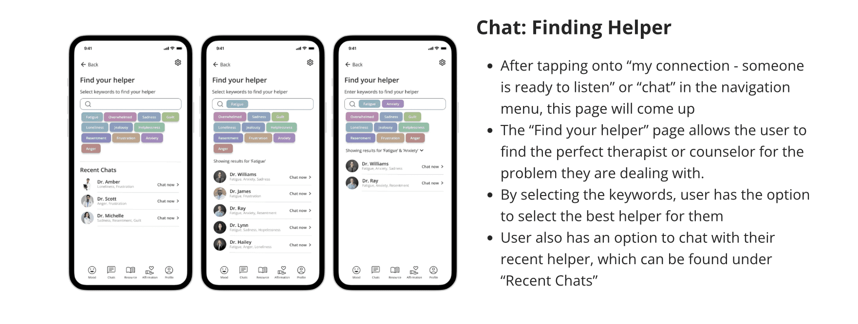
As a student who wants to excel in coursework and extra-curriculars, I seek an app that assist me in managing my fatigue and anxiety by facilitating connections with suitable therapist for discussing my concerns
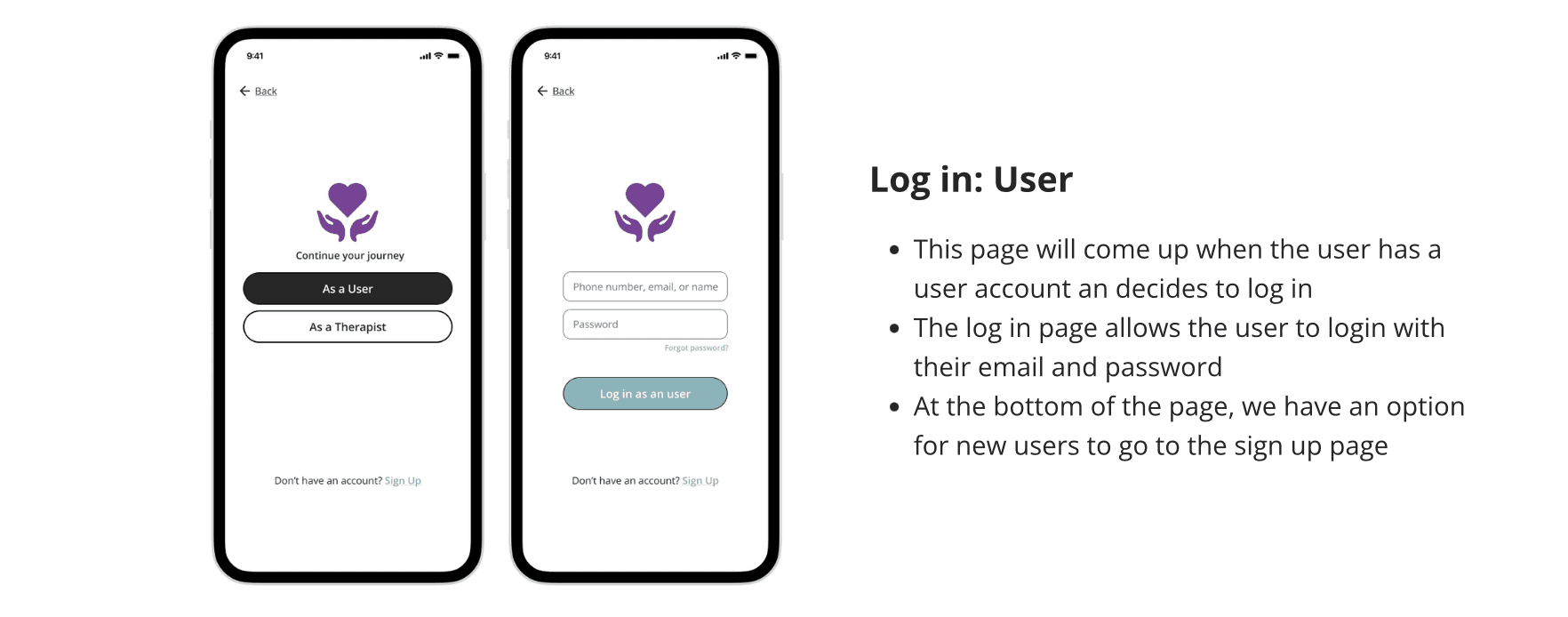
Task 1: Sign into the app and log your mood as good and share it with your therapist
Task 2: Log in as an existing member and find someone to talk to if you struggle with fatigue and anxiety
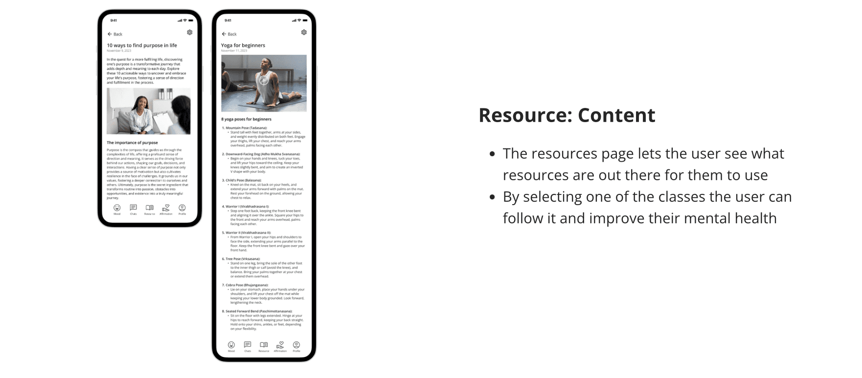
Task 3: Log in as an existing user and find yoga video to help you relax
Participant Profile
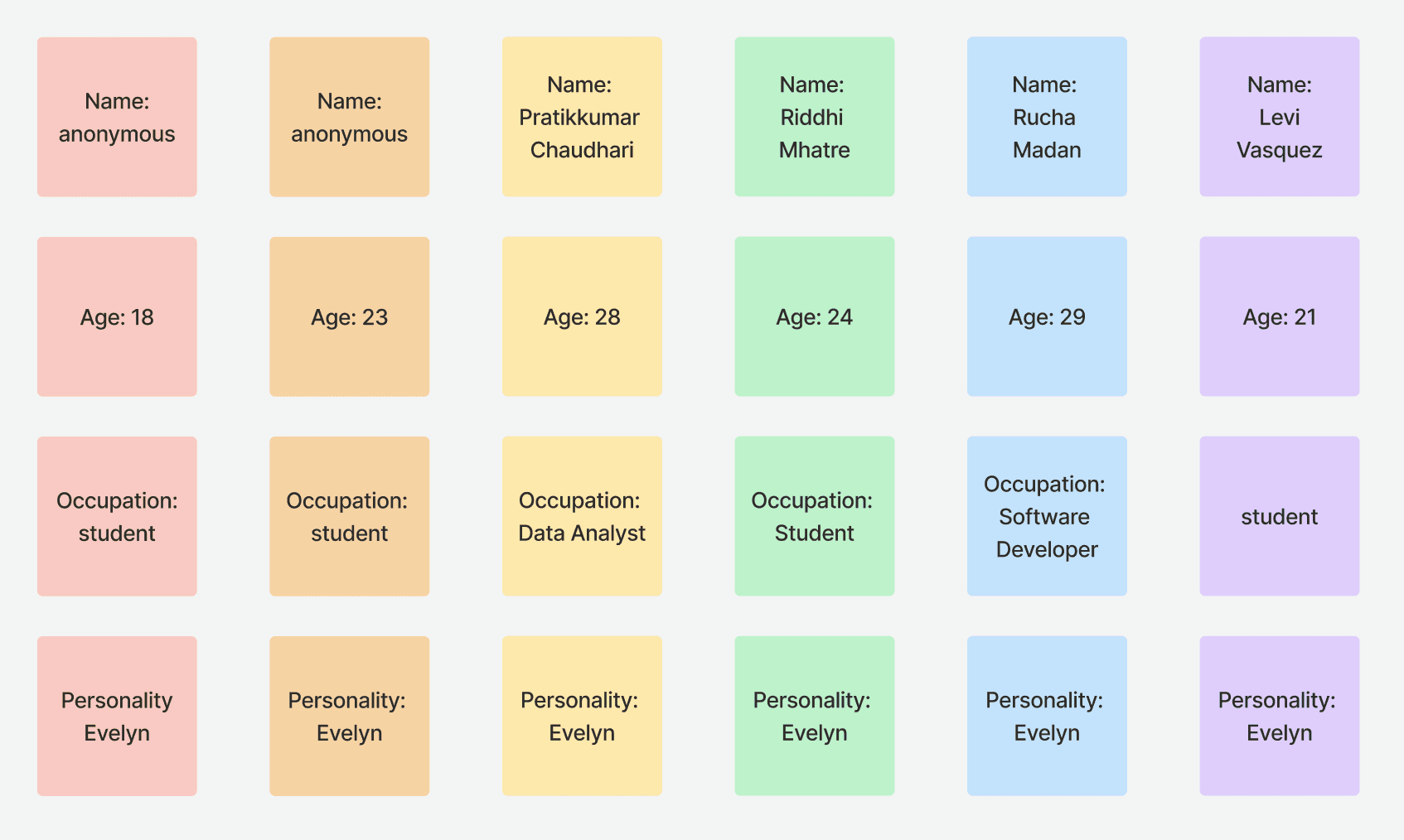
Testing was conducted with six potential users embodying the personality traits of Evelyne. Our interviewees, aged between 18 and 29, encompassed students and working professionals.
Pain Points
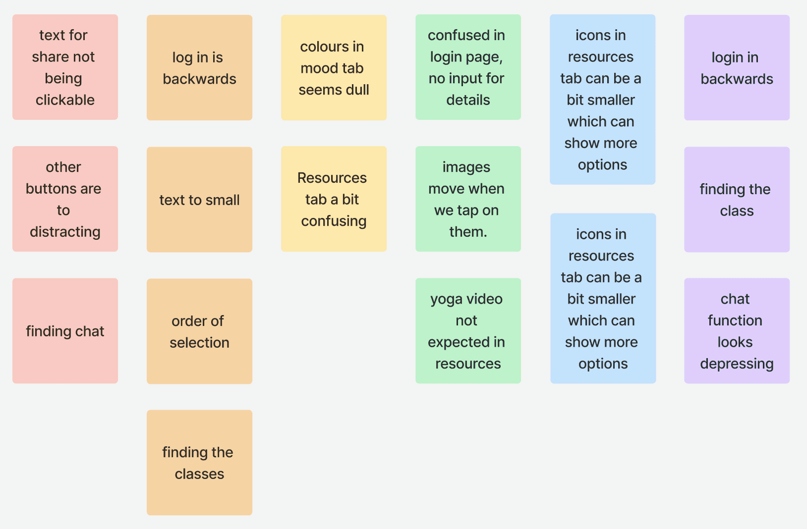
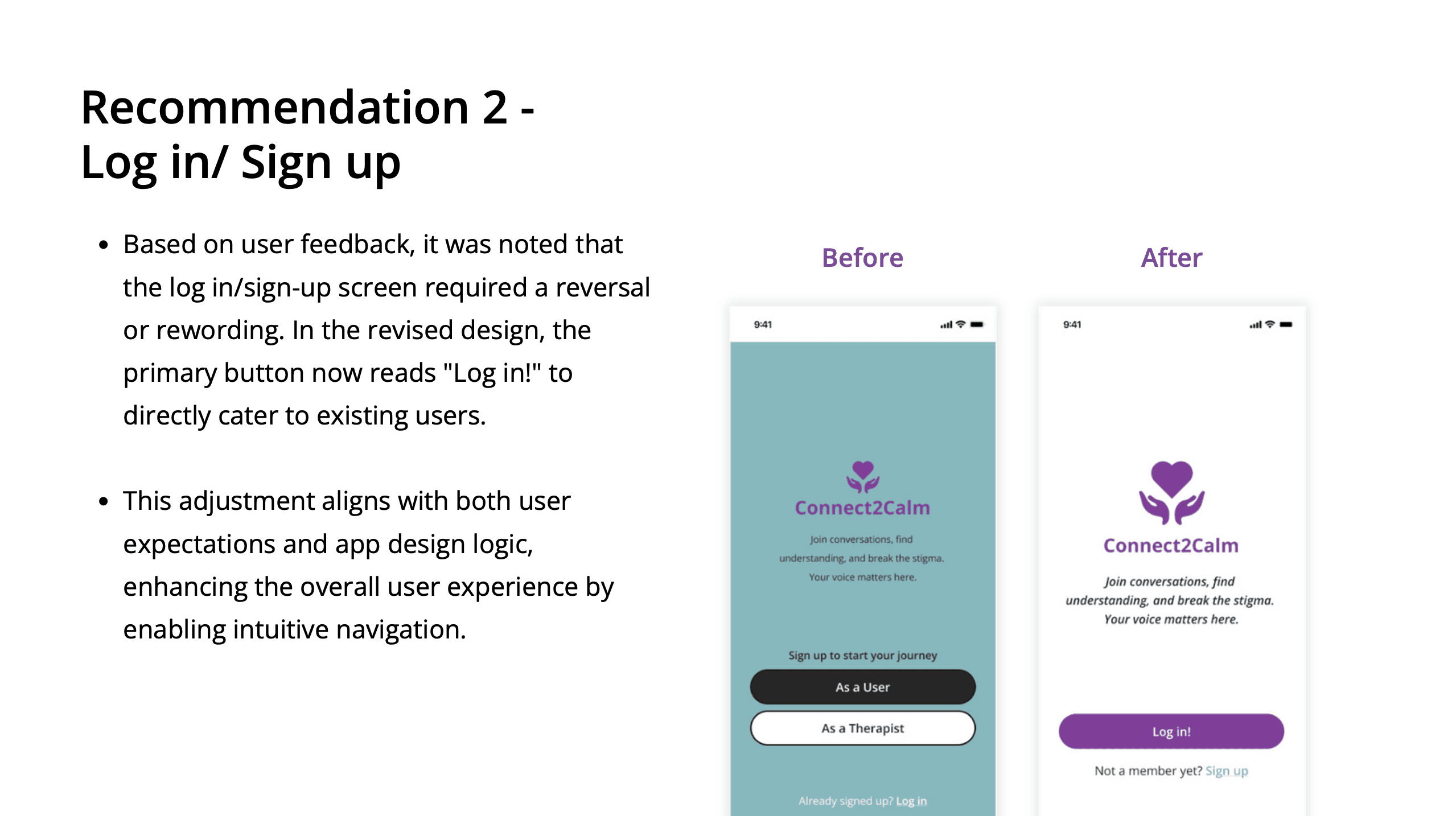
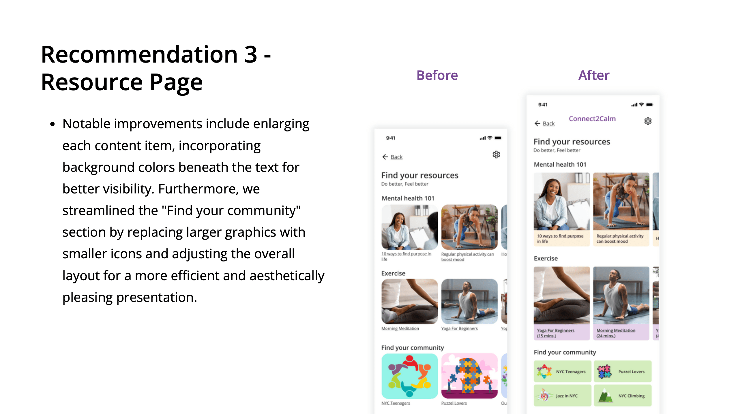
Participants expressed concerns that the login/sign-up screen appeared in reverse order. Additionally, they noted instances where images could move, and some images/icons were unclear within the resources function. Another observation was that certain text elements were too small to read, suggesting that slightly larger text could enhance overall readability.
Observations & Insights
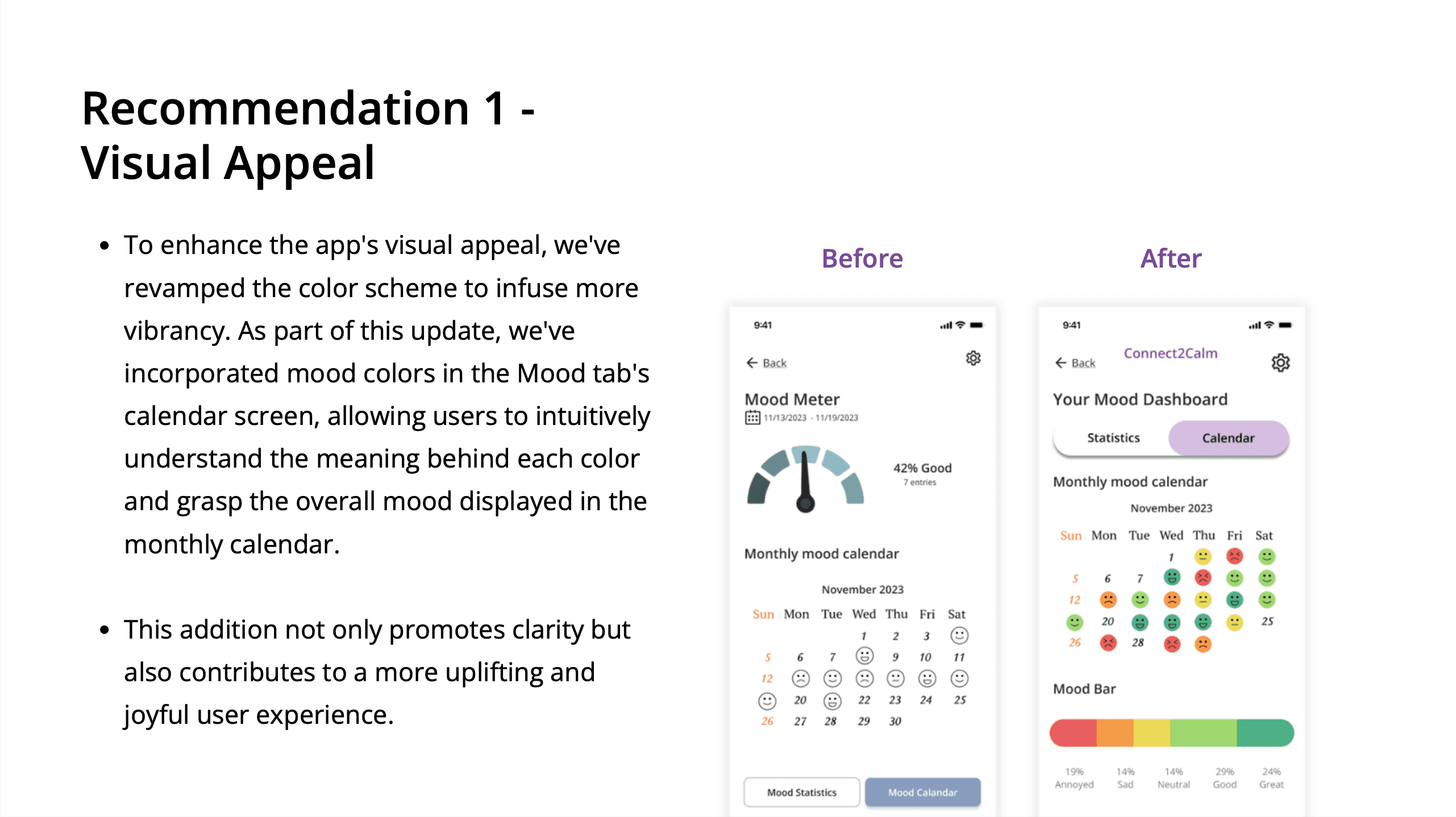
Participants reported that they want a more aesthetic yet calming color scheme, especially the chat function. We also observed that users have difficulty finding the yoga videos in the right way. We also discovered that the login needs to be improved.

Core Needs
Participants expressed a desire for a redesigned resources tab, suggesting a potential change in theme colors to create a happier atmosphere. Additionally, they recommended adjustments to the login/sign-up screen for an improved user experience.

Suggestions
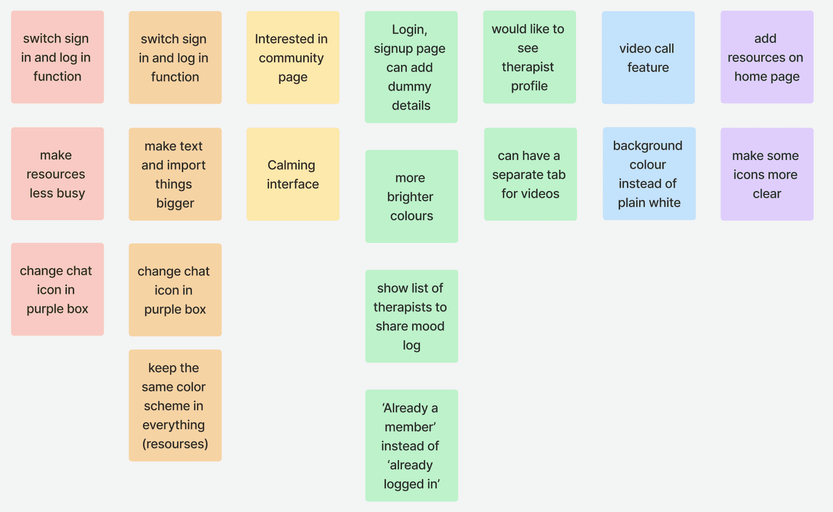
Gathered diverse suggestions about the redesign of the Resources function to enhance its organization and recommendations for improvements in the Login Page, color theme, and Chat feature. Additionally, there was interest expressed in exploring the “Find your community” function.
Recurring Themes
Here are the recurring themes from our qualitative data, highlighting some pain points and suggestions for future adjustments.
Color Scheme:
Users expressed a desire for a more authentic and calming color scheme.
Navigation Issues:
Users found it challenging to locate specific places, such as the yoga class in the resources function.
Text and Icons:
People faced difficulties in reading the text and interpreting icons.
Image Stability:
Users observed that some pictures in the resources function were movable
Login/Sign-up Screen:
Feedback suggested that the screen looked good but had issues with the order or wording.
Button Placement:
Users felt that buttons on the interface could be distracting and suggested they be moved or changed to better align with the task at hand.
Quantitative Analysis
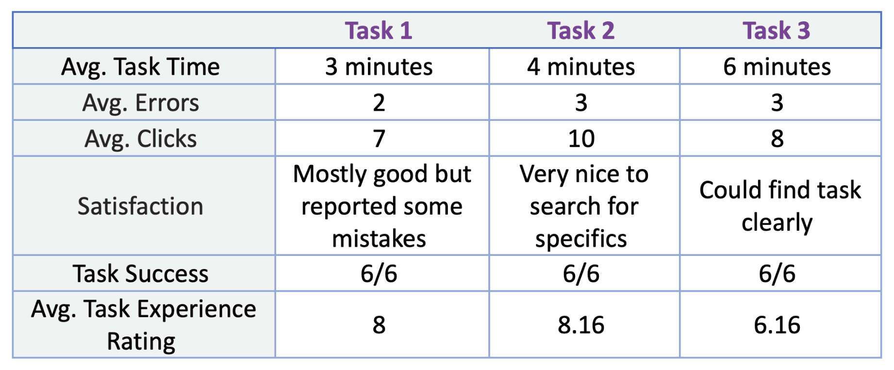
During testing, in addition to recording users' responses, we captured basic metrics for each task, such as average time spent and errors made.
Task 2 received the highest user rating, while improvements are needed for Task 3, specifically the Resource page.
SUS Score
From the collected responses, users reported encountering minimal issues with the prototype, and expressed a notable satisfaction level attributed to its user-friendly interface and seamless navigation.
The positive feedback (87 on SUS score) serves as a validation of our project among users who participated in the usability tests.
Recommendations For Improvements
3 key learnings and takeaways we learned from the usability tests conducted with six participants. We’ve identifies pain points in our design and will implement future adjustments based on the following insights:
Recommendation 1: The color scheme of the app needs to be looked over and made happier or calming
Recommendation 2: The log in/sign up screen needs to be reversed or reworded
Recommendation 3: Redesign the Resource page
Iterations
Next Steps
In the future phases of app design, we would like to take two key steps:
Therapist version: Explore a more comprehensive version of the therapist interface, refining features for improved interaction and support provision.
Multilingual: Make the app multilingual, with the goal of global distribution to extend mental health assistance worldwide.
